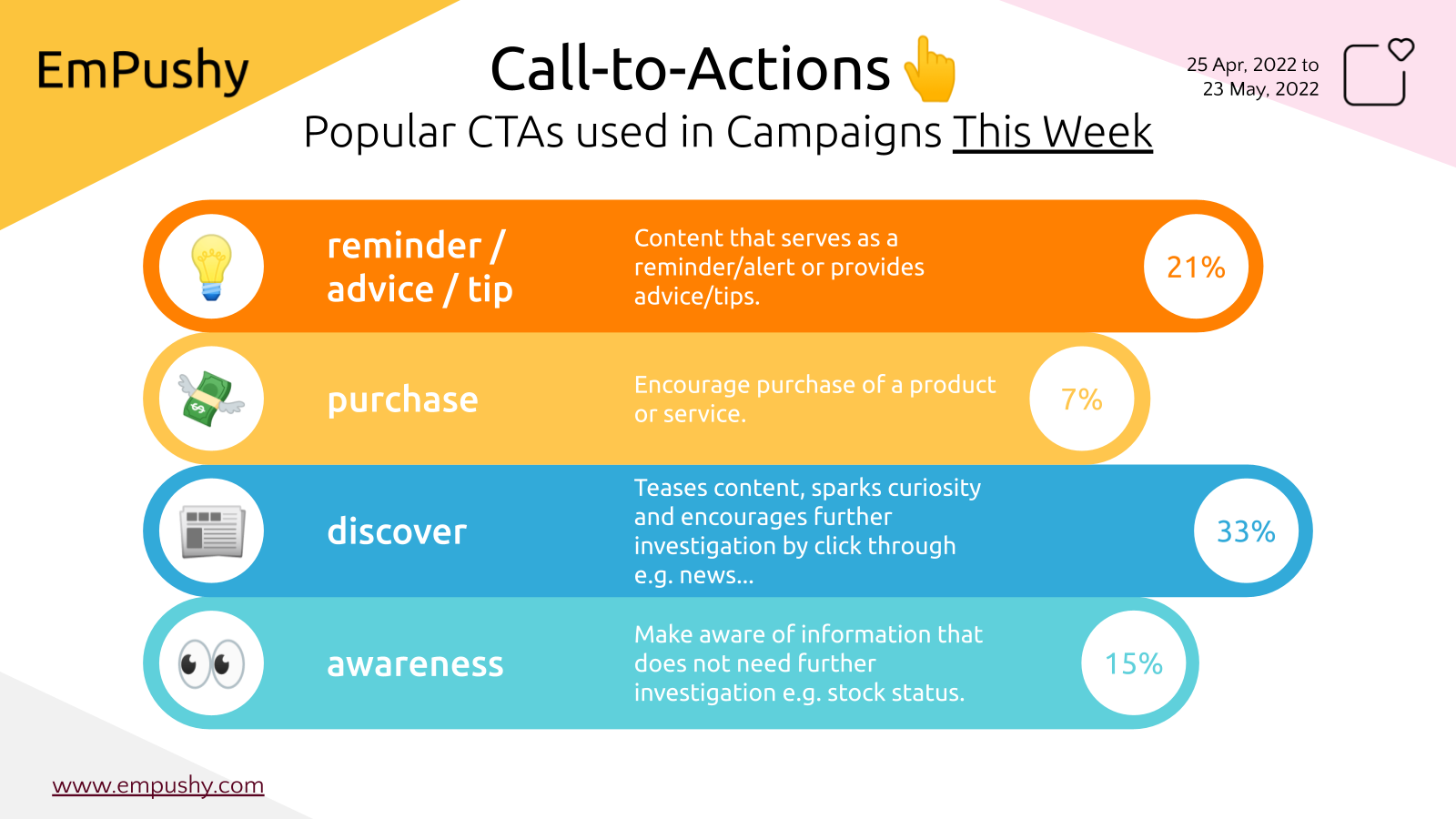
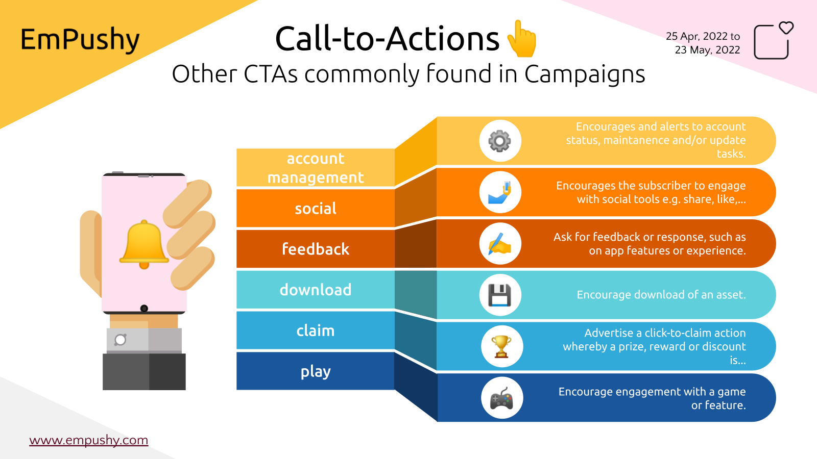
What Are Call-to-actions?
Call-to-actions (CTAs) are the buttons, links, and text that bring you to the next step of a conversion process. If you're trying to get people to sign up for a newsletter or download an eBook, the CTA is the "Subscribe" or "Download" button. The CTA is usually represented by a large green "Buy Now" button if you're trying to get people to buy a product online.

How to Write a Call-to-action
Call-to-actions are essential to any successful campaign because they guide website visitors through your conversion funnel, allowing you to track how many people respond to each of the various CTAs on your page. However, for your CTAs to be effective, they must follow these guidelines:
Use strong action words
Use words that will provoke emotion or enthusiasm in your audience. For example, if you want people to subscribe to your mailing list, use words like “get,” “sign up,” “join,” and so on. These words are more likely to get a better response from your audience than generic words like “click here” or “learn more.”
Provoke emotion or enthusiasm
A call to action should be designed to provoke emotion or enthusiasm in your audience. For example, if you want people to click on an image or link, you can add text such as “click here now!” above the image or link to provoke emotion and urgency in your readers. You can also use phrases like “this is amazing!” before including a link for more excitement and appeal to your readership.
Make them clear and obvious.
The call to action should be easy to see and understand. It should be placed at the top of the content, above the fold, and in a prominent place on the page. The best place for your CTA is on the right side of your blog post or article; this is where most people look first when they view a web page.
Make them visually appealing.
Your call to action should be not only straightforward but also visually appealing so that it catches your visitor's eye and entices them to click on it. Use color to draw attention to it, make it stand out from other elements on your page by using white space around it, or use an image that matches with the rest of your content but also draws attention to itself, such as using a picture of an open book with text saying “click here.”
Think up your own
The best way to come up with a good call-to-action is to think about what is most likely to motivate your readers and then suggest it directly. If you have a product or service that you want people to buy, use specific and unambiguous language. "Buy now" or "Learn more" work better than vague phrases like "Join us."

Call to action benefits
The goal with this extra information is usually two-fold:
- To help convince people who may be on the fence about taking the desired action by giving them a reason why it's worth doing so (you want them to do something now, but they don't yet see the value in doing so)
- To differentiate yourself from competitors who don't offer any additional value beyond simply instructing, if everyone just says "click here" or "buy now," there's no real reason for someone to choose you over another company.
Additional reading
Conclusion
Because online shoppers are looking for items to buy, big brands are using the call to action, creative language, and interactive banners across their website and advertising channels to drive traffic and leads, encourage consumers to share content, and ultimately increase sales.